
Root Cause Functional Medicine
A virtual functional medicine practice, taken from brand research through a Figma design system to a Next.js build running in production.
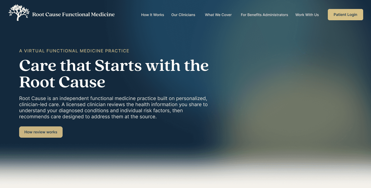
FIG. 01 · RCMEDICINE.COM, HOME
9
WEEKS, RESEARCH TO LAUNCH
8
PAGES LIVE ON VERCEL
20
CLINICIANS ONBOARDED
01 / BRIEF
Truemed lets people spend pre-tax HSA and FSA dollars on health and wellness. Root Cause is the independent clinical practice that reviews a patient’s submitted health information and issues the letter that makes those purchases eligible. It needed a public site, and it did not have one.
Research, brand, design system, build
9 weeks, summer 2026
Solo, with clinical and operations review
Figma, Next.js 16, Tailwind v4, Vercel
8 pages in production, 20 clinicians onboarded
02 / RESEARCH
I mapped five telehealth practices against two axes: whether the site speaks to patients or to institutions, and whether it earns trust through named clinicians or through compliance badges. Consumer brands lead with providers. B2B platforms lead with certifications. Root Cause needed both, because a patient and a benefits administrator read the same site. The sitemap came out of that, eight pages with a defined job each.
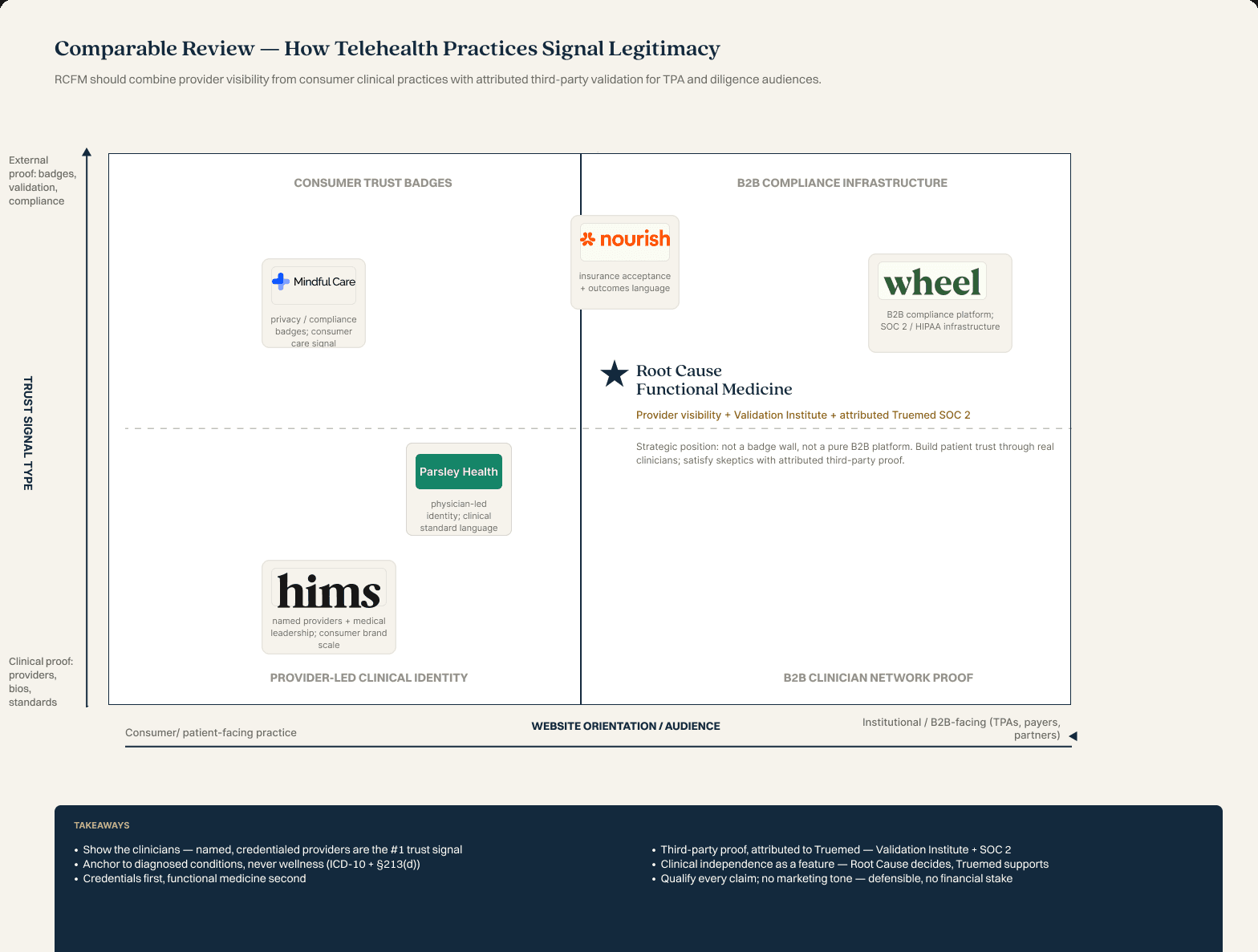
FIG. 02 · COMPARABLE REVIEW
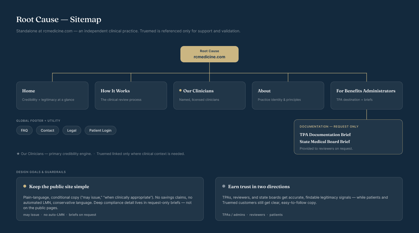
FIG. 03 · SITEMAP, EIGHT PAGES
03 / BRAND SYSTEM
Three directions, each built out as a full lockup on light and dark: a monogram seal, a Japanese lace leaf maple, and a labyrinth tree. The palette settled on navy, clinical blue, sage and champagne, with Quincy CF for display and Switzer for text.
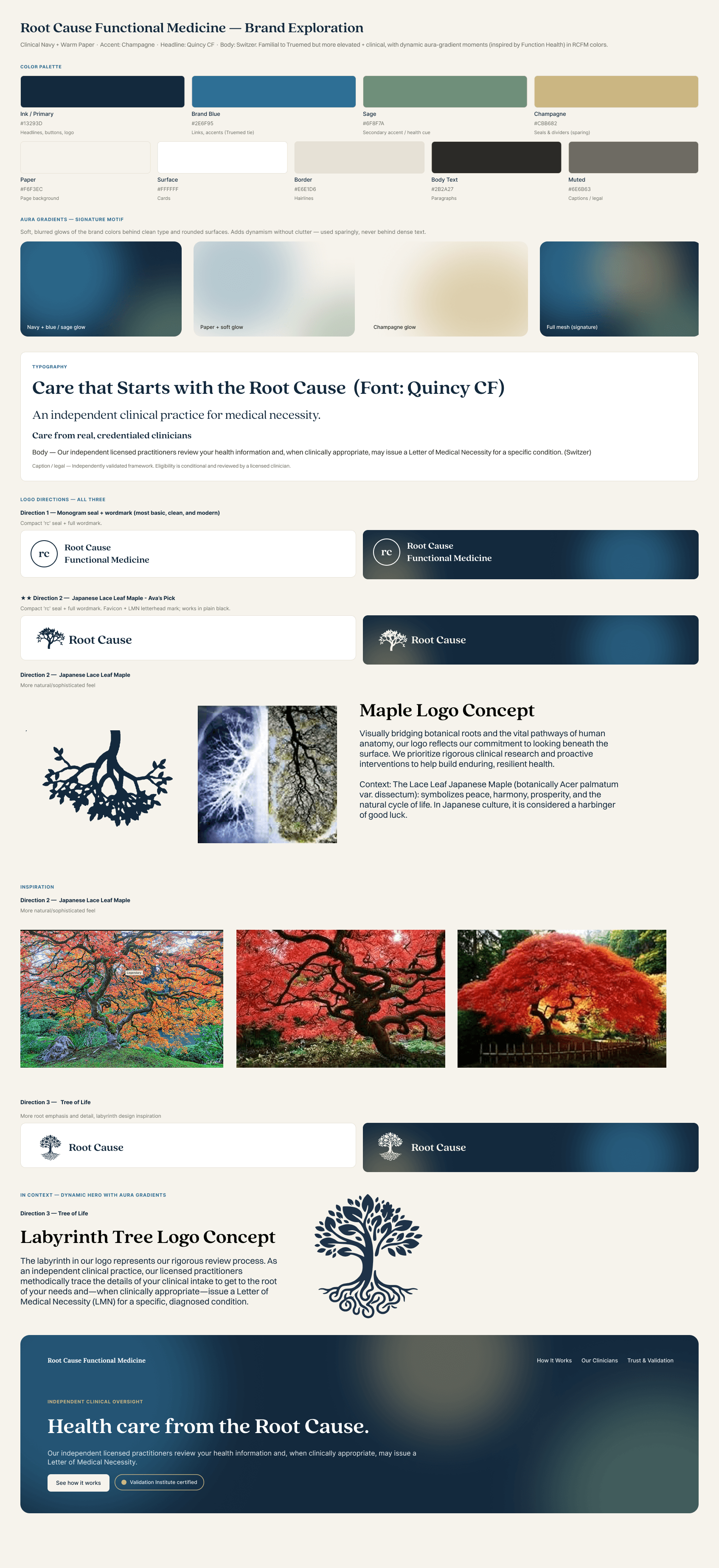
FIG. 04 · BRAND EXPLORATION V1
Truemed’s logo has a story behind it, so I wanted Root Cause’s to have one too.
I chose the Japanese lace leaf maple for two reasons. Inverted, the branch structure resembles human anatomy, the vascular and nervous pathways. And the root system matches what the practice does, which is tracing a complicated structure back to where something starts.
The tree also carries associations with peace and harmony in Japanese culture. That went into the brand documentation alongside the anatomy reasoning.
The palette had to complement Truemed and also stand out as its own brand. Clinical blue carries the medical credibility, and the warm neutrals keep it inviting rather than institutional. Root Cause is run by real clinicians who see patients, so the brand had to stay warm without losing authority.
Color and type were then built as tokens, not as swatches on a page, with a type scale and a component library above them. The point was that the build could stay consistent without anyone remembering a hex code.
#F6F3EC cream, #FFFFFF, #E6E1D6 sand
#2B2A27, #6E6B63
#13293D navy, #2E6F95 blue, #CBB682 gold
#6F8F7A sage
Quincy CF display, Switzer text
04 / DESIGN REVIEW AND THE REFRAME
The site first led with the letter of medical necessity, because that is what the practice issues. The first design review asked for the opposite: more of the practice, and less of the paperwork.
With the research and the brand settled, I designed all seven pages and put them up in FigJam for review. The feedback converged on one thing.
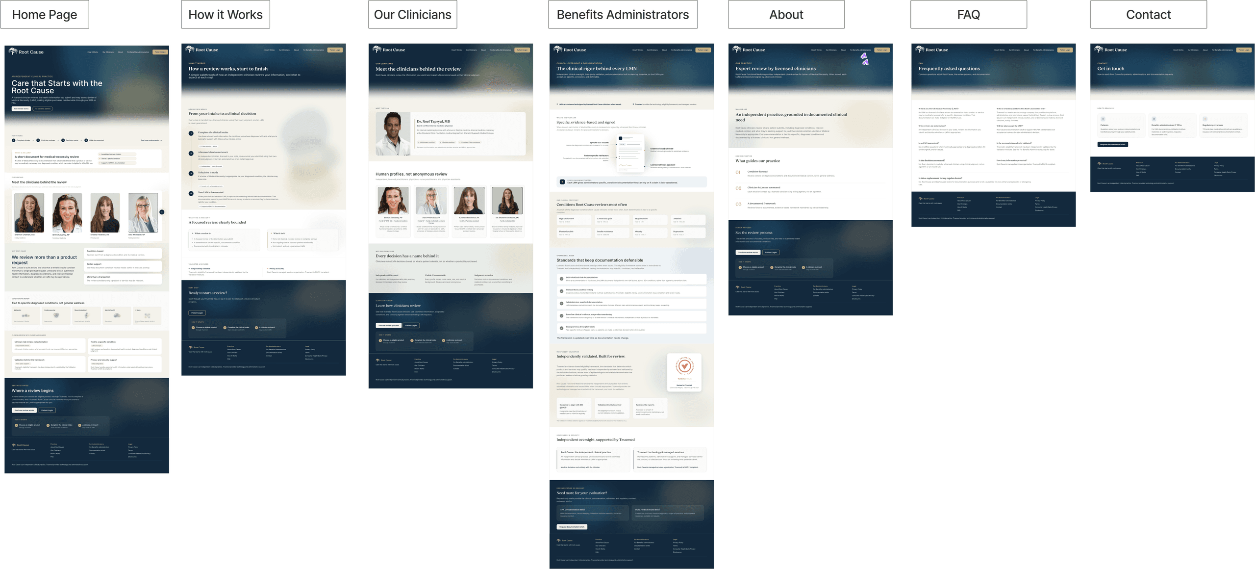
FIG. 05 · THE FIRST FULL DESIGN, SEVEN PAGES
“Is this putting us too tightly in a box? I imagine RCFM will grow beyond just LMNs as Truemed grows. I think we should focus more on unlocking preventative medicine as our hero text.”
I set up a separate session with the Root Cause clinicians to work through what the practice wanted a patient to understand first. Four things came out of it, and they reshaped the middle of the site.
A researched section naming what the practice actually assesses, across metabolic, cardiovascular, musculoskeletal and mental health.
Why the practice exists: catching a problem early, and giving people access to preventative care instead of waiting for a condition to worsen.
Real names and faces against every review, so a letter reads as a clinician’s judgment rather than an automated output.
Independent clinical judgment, evidence tied to a diagnosed condition, and the validation behind the framework, all stated on the page.
The letter is still on the site. It is explained two thirds of the way down, once a reader knows what the practice is for.
05 / BUILD
Eight pages built in Next.js and Tailwind and shipped to production on Vercel, with twenty clinicians onboarded and their bios written. The clinicians page was the one that had to carry credibility, so it leads with people rather than credentials.
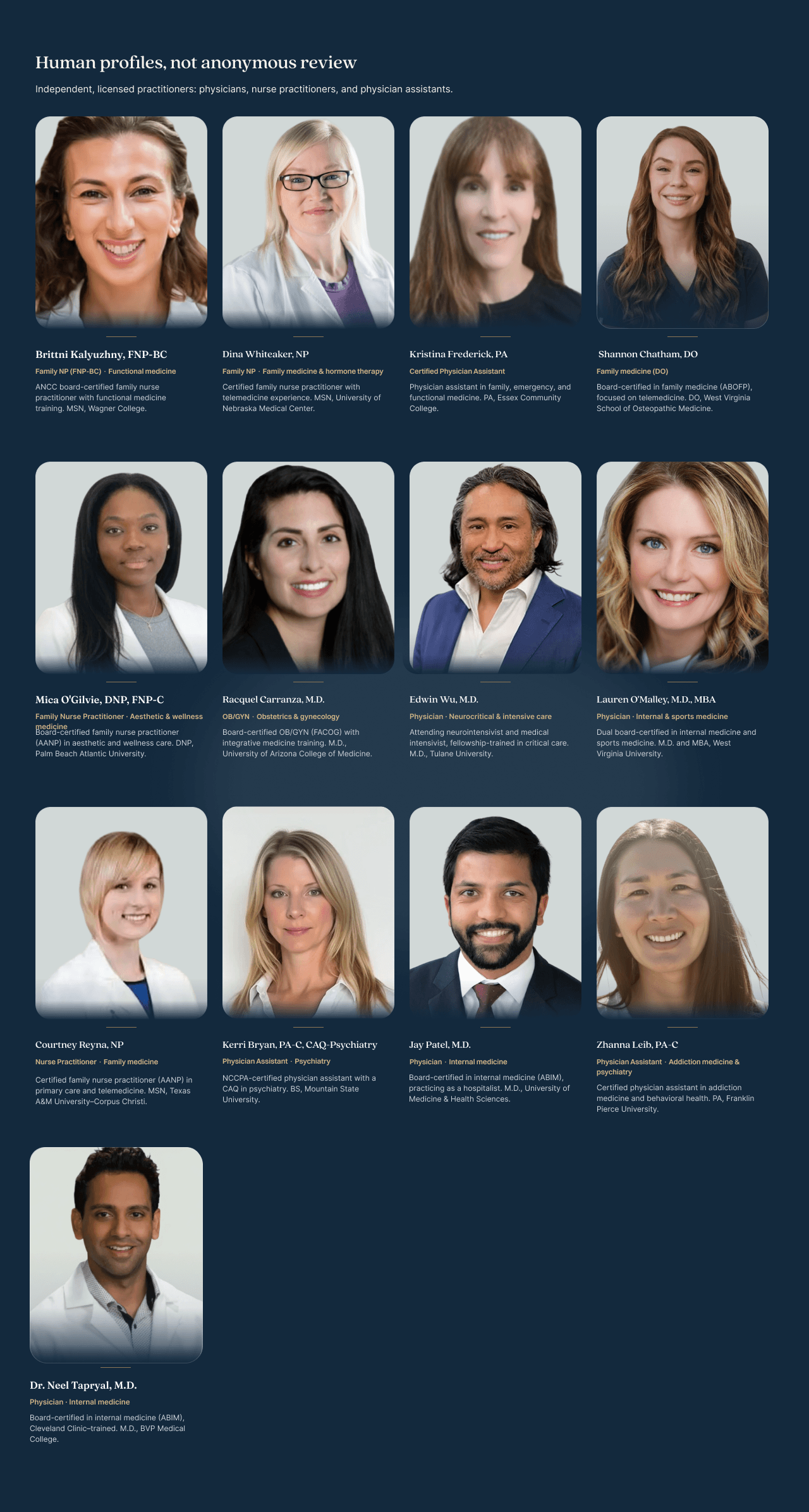
FIG. 06 · OUR CLINICIANS, TWENTY PROFILES
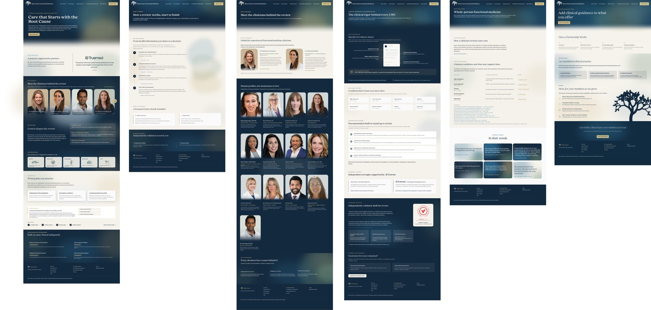
FIG. 07 · THE SHIPPED SITE, SIX OF EIGHT PAGES